In recent newsletters we covered the concept of “lock-in”, the trend of people staying in their homes purchased with historically low interest rates to avoid facing higher rates and an extremely unaffordable housing market. Lock-in has contributed to the lack of affordability by gumming up housing turnover, reducing available inventory, and putting upward pressure on home prices. We thought we’d take a closer look from the perspective of current homeowners to better understand how pervasive the “problem” is.
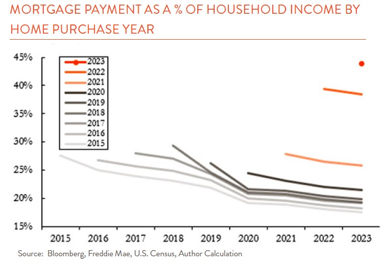
So just how good do homeowners have it? Really good. The chart below shows mortgage payments as a percent of household income, with a line for each “cohort” of borrowers who purchased homes in the same year. If you bought a house pre-pandemic, you started off with 25% -30% of your income going toward the mortgage payment. But then two things happened. First, household income continued to increase while your mortgage payment was fixed. And second, crucially, you always had the option to refinance if rates were ever lower than when you bought your house.

And they were. In 2020 and 2021, national averages for 30-year fixed rate mortgages got as low as 2.65%. So, if you took out a 4.50% mortgage in 2018, a few years later you could refinance and shave off nearly two percentage points—that’s huge savings. The chart shows that sharp decline around 2020, and the continued trend lower as those homeowners happily made their lower payments while income continued to increase.
The result is that those who bought homes pre-pandemic now pay below 20% of income on average. That’s a far cry from the 44% of income 2023 buyers face (orange dot) after the sharp rise in mortgage rates and home prices. It’s no wonder homeowners are reluctant to move—imagine going from paying $1,000 per month to paying $2,700 per month for the same house! However, the chart assumes everyone who could obtain a lower rate by refinancing did so. The actual picture is a bit more nuanced but still stark.

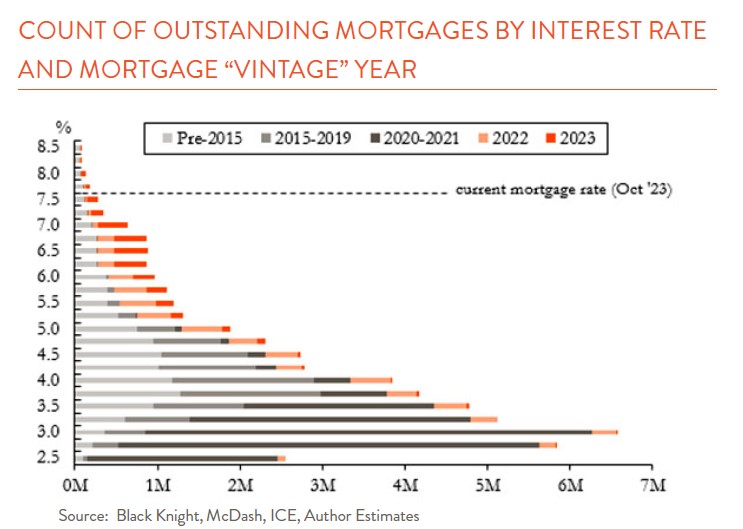
The chart to the right shows the numbers of outstanding mortgages by interest rate, colored by the year the mortgage was taken out. Note, this is different than when a home was purchased—a home bought in 2015 but refinanced in 2020 shows up in the 2020 “vintage” because that’s when the outstanding mortgage was originated. The first thing to notice is the sheer volume of mortgages in the low-rate pandemic vintage of 2020-2021—around 40% of all outstanding mortgages in the U.S. were originated in those two years (dark grey)! Most of them were refinanced older mortgages. The second is the concentration of mortgage debt in low rates, with nearly 85% of mortgages under 5%.
Clearly not everyone took advantage of low interest rates to refinance, but the vast quantity that did helped anchor the mortgage universe well below current rates. With these dynamics at play, it is evident why lock in is having such an impact on the availability of homes for sale.